Building on Success: From Water Bills to Real-Time Energy Monitoring
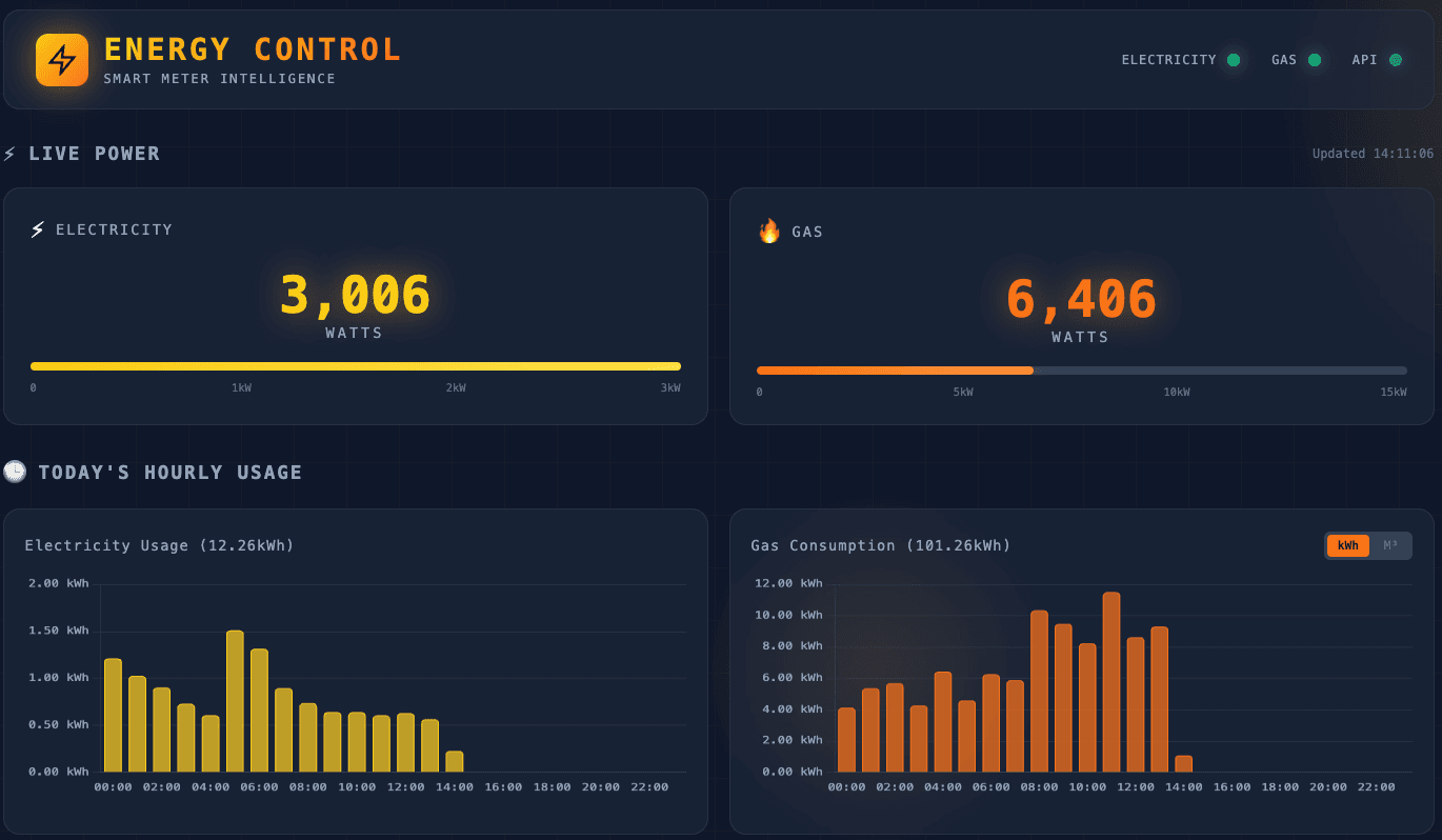
Following the success of my Thames Water dashboard, I built a real-time energy monitoring system. This time with proper APIs, live data every 10 seconds, and years of historical consumption at my fingertips.
When One Dashboard Leads to Another
In my previous post about building a Thames Water monitoring system, I described how a shocking water bill and my Personal AI Consultant led me to build a full monitoring dashboard. That project was a success, I found the culprit (our gardener's bi-weekly watering sessions), learned a lot about web scraping with Selenium, and ended up with infrastructure I use regularly.
Being naturally inquisitive, I started looking around for the next opportunity.
The answer was sitting in my kitchen: the smart meter in-home display (IHD), showing real-time electricity and gas usage. I'd glance at it occasionally, watch the numbers jump when the washing machine started to confirm it wasnt some sort of hoax device, then forget about it. All that data, going to waste (a great loss for a data geek such as myself).
What if I could capture it, store it, analyse it, and build another dashboard?
A Different Kind of Challenge
The water dashboard had been an interesting exercise, taking a dull task of following up on a water bill and turning it into a fun learning opportunity. Thames Water doesn't offer an API, so "we" (mainly Claude) built a Selenium scraper that navigates their JavaScript-heavy website, captures network responses, and extracts the data. It works, but it's fragile, any website redesign could break it.
Energy monitoring offered a different challenge entirely:
The good news: There are actual APIs available. GeoTogether (the company behind my IHD) provides an API for real-time data. Glowmarkt's Bright app provides access to historical data via the DCC (Data Communications Company) network—the same official data your energy supplier sees. I had researched this previously in one of my Home Assistant projects and found out that in the UK everyones meter readings get stored in this central DCC database and various providers give you the opportunity to access your data through their API.
The opportunity: Instead of fighting with web scraping, I could focus on learning proper API integration patterns—authentication, token management, rate limiting, error handling. Real software engineering skills rather than browser automation workarounds which feel a bit "hacky".
The data richness: Real-time updates every 10 seconds. Historical data going back years. Multiple data sources to cross-reference and validate (another data-geek feeding frenzy).
This wasn't just about building another dashboard. It was about building up my API integration skills while creating something genuinely useful, or so I tell myself.
What I Wanted to Keep the Same
Despite the different technical approach, I wanted to maintain the principles that made the water dashboard successful:
-
Running on my Raspberry Pi home server — My little £80 Pi 5 was already hosting the water service. Adding energy monitoring would expand its usefulness without additional cost.
-
A consistent dashboard aesthetic — The dark theme with cyan accents I'd built for water worked well. For energy, I'd adapt it with appropriate theming—electricity yellow, gas orange—while keeping the same glass-morphism cards and Chart visualisations.
-
Proactive alerting — The water dashboard alerts me to usage spikes. With real-time energy data, I could be even more proactive—catching a forgotten appliance drawing power continuously, or spotting anomalies as they happen rather than days later.
-
The "Teach Me" approach — This was crucial. Following Daniel Miessler's "Keep the Robots Out of the Gym" philosophy, I wanted to understand everything we built. Not just use it, but really understand it.
-
Sharing with the community — The complete codebase would go on GitHub, including a comprehensive tutorial walking through every aspect of the code.
The Technical Journey
The "Secret" API That Doesn't Exist
Here's the thing about GeoTogether: if you contact their support and ask about API access, they'll tell you "there is no consumer-facing API."
Except there is one. And it works.
I'd actually spent considerable time researching this before the dashboard project even started. My original goal was to get smart meter readings into Home Assistant, my home automation platform. The official answer was discouraging, but digging through the Home Assistant community forums, I found that several users had reverse-engineered the API that the GeoTogether mobile app uses.
The process they'd documented was... involved:
- Authentication — POST your credentials to get an access token
- Device discovery — Make another request to find your device ID (the system doesn't just know which meter is yours)
- System ID lookup — Yet another request to get the specific system identifier
- Actual data requests — Only now can you query live readings, costs, and tariffs
- Token management — Oh, and that access token expires after 50 minutes, so you need to handle refresh
I'd previously got this working through trial and error, following the breadcrumbs left by helpful forum members who'd figured out the curl commands. When I started building this dashboard, I had all that prior research—and Claude was able to piece together the complete API client from my notes and experiments.
Token-Based Authentication Done Right
With the API endpoints understood, the next challenge was implementing robust authentication. Of course authentication is an important part of using APIs but annoyingly everyone seems to use a slightly different way of making it work. In the case of this API the authorisation token expires after 50 minutes, so at around 45 minutes you need to run a separate refresh process that gets a new token. Fortunately Claude knows all about token-caching (and now so do I!). If you have a vague interest in the nuances of how this works in practice, it is well covered in the Tutorial materials.
Connection pooling was another pattern I hadn't the foggiest idea about, but apparently when running an API that is going to make requests every 10 seconds it is pretty important. So, instead of creating a new HTTP connection for each request the httpx library's Client object maintains a connection pool, dramatically improving performance when making frequent API calls.
Two Data Sources, One Truth
Here's where it got interesting (ok not really but for me, mildly so). I had two completely different APIs providing energy data:
GeoTogether connects to my in-home display via their cloud. It provides real-time power readings (updated every 10 seconds), current costs, and tariff information. Great for live monitoring, but limited historical data.
Glowmarkt/Bright connects to the DCC network—the official smart meter data infrastructure. It provides historical consumption data going back years, with half-hourly granularity. Perfect for analysis, but with a delay of hours to days.
The solution: use both. GeoTogether for real-time monitoring, Glowmarkt for backfilling historical data and verification. The architecture handles this elegantly:
┌─────────────────┐              ┌─────────────────┐
│  GeoTogether    │              │   Glowmarkt     │
│  (Real-time)    │              │   (Historical)  │
└────────┬────────┘              └────────┬────────┘
         │                                │
         └───────────┬────────────────────┘
                     │
              ┌──────▼──────┐
              │   SQLite    │
              │   Database  │
              └──────┬──────┘
                     │
              ┌──────▼──────┐
              │  Dashboard  │
              └─────────────┘
Both sources feed into the same database, with a source column tracking where each record originated. This lets me compare sources, identify discrepancies, and have confidence in the data accuracy.
The Aggregation Pipeline
One pattern I needed was the aggregation pipeline. Every 10 seconds, the scheduler captures a live power reading in watts. That's 8,640 readings per day—useful for spike detection, but too granular for trend analysis.
At 2 AM each night, an aggregation job processes the previous day's readings:
# Convert watts to kWh
# Power (W) × Time (hours) = Energy (Wh)
# 10 seconds = 10/3600 hours

for reading in daily_readings:
    total_wh += reading.electricity_watts * (10/3600)

total_kwh = total_wh / 1000
The result: a single daily summary record with total consumption, costs (calculated using the applicable tariff), and averages. The raw readings stay available for detailed analysis, but the dashboard queries the efficient summary tables.
Monitoring the Monitor
One feature I added that the water dashboard lacks: connection status monitoring.
Smart meters communicate via Zigbee to the in-home display, which then uploads to the cloud via WiFi. Any link in that chain can fail. The GeoTogether API provides Zigbee status information:
{
  "zigbeeStatus": {
    "electricityClusterStatus": "CONNECTED",
    "gasClusterStatus": "CONNECTED",
    "hanStatus": "CONNECTED",
    "networkRssi": -65
  }
}
My dashboard now shows connection health. If the Zigbee link drops or signal strength degrades, I'll know immediately rather than wondering why data stopped appearing.
The Tutorial: 4,400 Lines of Learning
Following the same "gym, not job" philosophy as the water project, I asked my AI assistant to create a comprehensive tutorial after the system was working.
The result: a 4,400-line walkthrough covering every aspect of the codebase:
- The Big Picture — Architecture overview and data flow
- Startup Sequence — FastAPI lifespan and initialization
- Configuration Management — Pydantic Settings and environment variables
- Database Layer — SQLite schema, models, and query patterns
- The Scheduler — APScheduler with interval and cron triggers
- API Routes — RESTful endpoint design and response schemas
- External API Clients — Token authentication, connection pooling, error handling
- End-to-End Walkthrough — Complete traces from meter to dashboard
Each section includes annotated code snippets, ASCII architecture diagrams, and comprehension questions. It's not documentation for future developers—it's a learning resource for me.
The difference between "I built this" and "I understand this" is the tutorial. I can now maintain, debug, and extend this system because I've learned about the patterns. What I really like is the analogies - because I told Claude I am not a professional programmer it has used some useful analogies to explain the concepts.
From Reactive to Proactive
The water dashboard is inherently reactive. Thames Water publishes usage data with a delay of hours to days. By the time I see a spike, the event is long over.
Energy monitoring flips this dynamic. With 10-second updates, I can:
- Spot anomalies in real-time — That constant 200W baseline overnight? Something's been left on.
- Track appliance signatures — The Tesla charger is definitely noticeable!
- Catch problems early — Unusual patterns trigger alerts while I can still do something about them.
The spike detection is simple but effective:
if live.power.electricity_watts > settings.electricity_spike_watts:
    create_alert(
        type="ELECTRICITY_SPIKE",
        message=f"High usage: {live.power.electricity_watts}W",
        severity="warning"
    )
With thresholds set appropriately (3000W for electricity, 5000W for gas), I get notified about genuinely unusual events without alert fatigue.
The Results
The system has been running for only a week now, and I've already gained insights:
Baseline discovery — Our home draws about 1000W continuously. That's higher than I expected—worth investigating further although I suspect having everyone home over the holiday period has contributed to that.
Peak identification — Charging the car is definitely the biggest draw on electricity (but I am not paying for petrol and it is still cheaper that way).
Cost awareness — Seeing costs accumulate in real-time changes behaviour. I am definitely more conscious of turning those lights off or taking a shorter shower (saving water as well as gas).
The dashboard is live at energy.gavinslater.co.uk. Have a look and see my actual consumption data—transparency in action.
What I Learned This Time
1. APIs Are Better Than Scraping (When Available)
The water scraper works, but it's fragile. Website changes, session handling, and JavaScript rendering all create failure points. The energy service, built on proper APIs, is far more robust. The lesson: always look for an official API first, even if it requires more research to find.
2. Multiple Data Sources Add Confidence
Having both GeoTogether and Glowmarkt means I can cross-reference data. When they agree, I trust the numbers. When they diverge, I investigate. This redundancy isn't just about backup—it's about data quality.
3. Real-Time Changes the Game
Delayed data is useful for analysis. Real-time data enables action. The psychological shift from "I consumed X yesterday" to "I'm consuming X right now" is an important distinction. It moves energy awareness from an abstract concept to a tangible, present-moment reality.
4. The Pattern Library Is Growing
Each project adds patterns to my toolkit. The water project taught me Selenium web-scraping, network interception, and async database access. The energy project added token management, connection pooling, and multi-source data aggregation. The next project will hopefully build on both.
5. Core Infrastructure Works
My Raspberry Pi now runs a lot more services: location data, health data aggregation, water monitoring, and energy monitoring. Each new service is easier than the last because the deployment infrastructure (Docker, NGINX-proxy manager, monitoring) already exists.
What's Next?
The energy dashboard opens possibilities and I'm already exploring what the next iteration is going to be. Suggestions in the comments would be welcomed. But for now, I'm enjoying the simple pleasure of understanding where my energy goes.
Conclusion
This project started because the water dashboard was such a success that I wanted to replicate it. What I built was something related but different—leveraging proper APIs instead of web scraping, working with real-time data instead of delayed reports, and handling multiple data sources instead of a single provider.
The constants remained: running on my Pi, maintaining design consistency, building comprehensive documentation, keeping myself in the learning loop, and sharing everything openly.
The energy monitoring service represents another step in my AI-assisted learning journey. Not AI doing the work while I watch, but AI as a collaborator that helps me build things I couldn't build alone while ensuring I understand every piece.
The "gym" philosophy continues to pay off. I can explain how token refresh works, why connection pooling matters, and how watts convert to kWh (well that is basic GCSE science but a good refresher). The tutorial isn't just documentation—it's proof that I did the mental reps.
What's the next dashboard? I'm not sure yet. But with my Personal AI Consultant and a growing infrastructure on my Pi, I know that when the right problem appears, I'll be ready to think bigger than just solving it.
The GeoTogether Energy Service is running at energy.gavinslater.co.uk. Built with FastAPI, httpx, Chart.js, and deployed on a Raspberry Pi 5 home server.
The complete codebase, including the 4,400-line tutorial, is available on GitHub: github.com/gavraq/geotogether-energy-service
This is Part 3 of my Personal AI Infrastructure series. Read Part 1: Building a Personal Consultant AI System for the foundation, and Part 2: Thames Water Monitoring for the project that started this journey.
Questions or feedback? Connect with me on LinkedIn or explore the tutorial and tell me what you think.
Related Articles
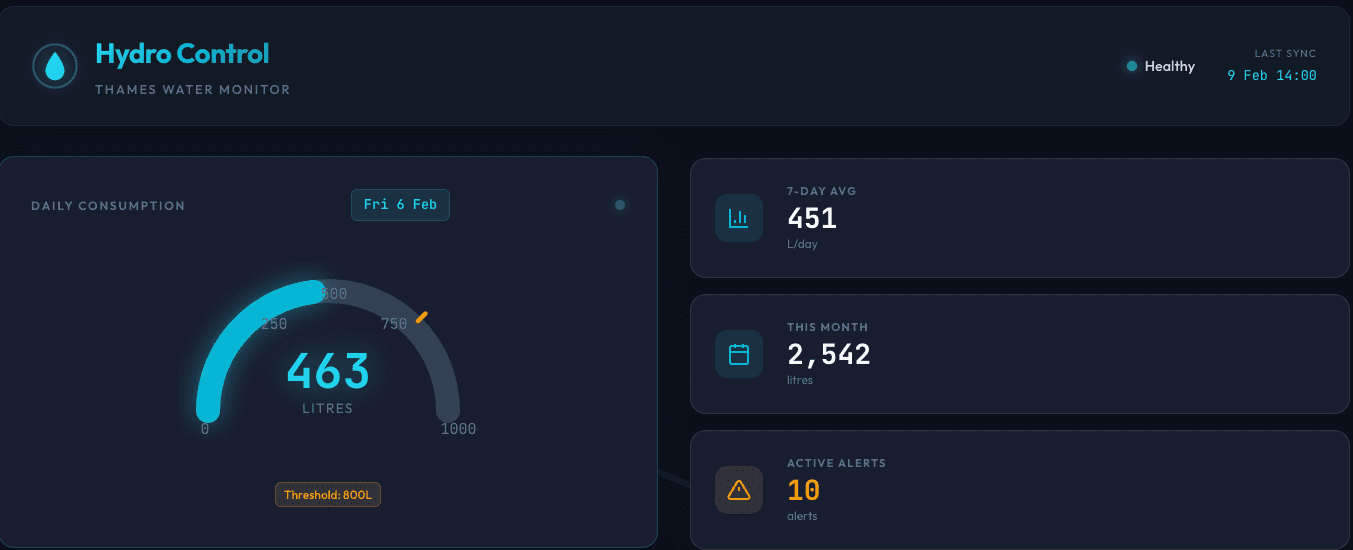
When Your Personal AI Consultant Helps You Think Bigger: From a crazy Water Bill to a Learning Opportunity
a shocking bill, a tendency to procrastinate, and a philosophy about keeping humans in the loop led me to build something far more valuable than I expected.
Dec 22, 2025

Building a Personal Consultant AI System - Architecture and Learnings
A deep dive into designing and implementing a production multi-agent AI system with Universal File Context architecture, managing daily operations and comprehensive life optimization.
Oct 21, 2025
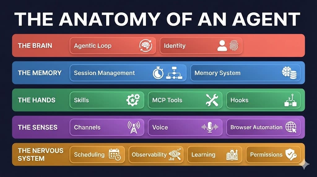
The Anatomy of an Agent: What's Actually Inside These AI Systems Everyone's Talking About
A leaked Signal chat, a personal AI project, and a viral open-source agent with 180k GitHub stars. Together they reveal what an agentic system actually consists of and why the same architecture powers both a personal assistant and an enterprise platform.
Feb 9, 2026